
Colleges
- AAC
- ACC
- Big 12
- Big East
- Big Ten
- Pac-12
- SEC
- Atlantic 10
- Conference USA
- Independents
- Junior College
- Mountain West
- Sun Belt
- MAC
- More
- Navy
- UAB
- Tulsa
- UTSA
- Charlotte
- Florida Atlantic
- Temple
- Rice
- East Carolina
- USF
- SMU
- North Texas
- Tulane
- Memphis
- Miami
- Louisville
- Virginia
- Syracuse
- Wake Forest
- Duke
- Boston College
- Virginia Tech
- Georgia Tech
- Pittsburgh
- North Carolina
- North Carolina State
- Clemson
- Florida State
- Cincinnati
- BYU
- Houston
- Iowa State
- Kansas State
- Kansas
- Texas
- Oklahoma State
- TCU
- Texas Tech
- Baylor
- Oklahoma
- UCF
- West Virginia
- Wisconsin
- Penn State
- Ohio State
- Purdue
- Minnesota
- Iowa
- Nebraska
- Illinois
- Indiana
- Rutgers
- Michigan State
- Maryland
- Michigan
- Northwestern
- Arizona State
- Oregon State
- UCLA
- Colorado
- Stanford
- Oregon
- Arizona
- California
- Washington
- USC
- Utah
- Washington State
- Texas A&M
- Auburn
- Mississippi State
- Kentucky
- South Carolina
- Arkansas
- Florida
- Missouri
- Ole Miss
- Alabama
- LSU
- Georgia
- Vanderbilt
- Tennessee
- Louisiana Tech
- New Mexico State
- Middle Tennessee
- Western Kentucky
- UTEP
- Florida International University
High School
- West
- Midwest
- Northeast
- Southeast
- Other
- Alaska
- Arizona
- California
- Colorado
- Nevada
- New Mexico
- Northern California
- Oregon
- Southern California Preps
- Washington
- Edgy Tim
- Indiana
- Kansas
- Nebraska
- Iowa
- Michigan
- Minnesota
- Missouri
- Oklahoma Varsity
- Texas Basketball
- Texas
- Wisconsin
- Delaware
- Maryland
- New Jersey Basketball
- New Jersey
- New York City Basketball
- Ohio
- Pennsylvania
- Greater Cincinnati
- Virginia
- West Virginia Preps
ADVERTISEMENT
Install the app
How to install the app on iOS
Follow along with the video below to see how to install our site as a web app on your home screen.
Note: This feature may not be available in some browsers.
You are using an out of date browser. It may not display this or other websites correctly.
You should upgrade or use an alternative browser.
You should upgrade or use an alternative browser.
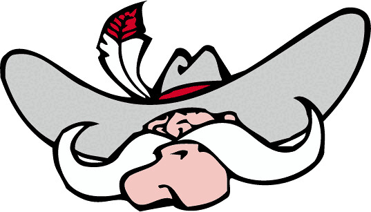
UNLV's new logo
- Thread starter khokhol8
- Start date
It took me a couple of minutes before I figured it out. SMH I don't think this New logo makes a first good impression. I sure hope they didn't just waste $250K on it like the MW logo!
While it was claimed that pressure to make a change was not "seriously" considered, I think it very much was. This logo is part of a slow transition to what might eventually be simply a mustache or a hat with a feather, or maybe none of that.
My take (maybe an unpopular one) - rip the band-aid off. Make our logo a shark and keep the name Rebels.
My take (maybe an unpopular one) - rip the band-aid off. Make our logo a shark and keep the name Rebels.

It looks to me like something that will be replaced in five years, so stand by. I'm sorry for those who donated to fund this, um, effort.
Wow. I actually see that. I thought you were joking.To me it looks like Jabba the Hutt with a sparkly red eye wearing a hat.
It took me more than 5 seconds to even see the face. If I had not read that the shape was the same as the welcome to vegas sign, I would have never gleaned that. The description says there are mountains. I still can't find them.
I'll bet all of that sounded great in a meeting, though.
I'll bet all of that sounded great in a meeting, though.
It looks to me like something that will be replaced in five years, so stand by. I'm sorry for those who donated to fund this, um, effort.
You can count on that. And when the change happens, even more of the Hey Reb! will be removed. Look at the transition...its obvious.
Oh, for the people who get butt hurt over changes made for PC reasons, check this whopper out!
We Wants the Redhead!


PC garbage.You can count on that. And when the change happens, even more of the Hey Reb! will be removed. Look at the transition...its obvious.
Oh, for the people who get butt hurt over changes made for PC reasons, check this whopper out!
We Wants the Redhead!
A shark would suck. What does that have to do with any UNLV athletics outside of bball? With the new stadium football will be king, but bball will still be very important.
Actually it has everything to do with UNLV. Jerry Tarkanian was much more than a basketball coach - he has done more than any other single person to build UNLVs brand. Jerry Tarkanian put UNLV on the map. So while you can argue an opinion that a shark as a logo would suck, you can't argue that a shark has nothing to do with UNLV.
As for football being king, that's wild speculation. And I hope you are right.
UNLV football already averages almost twice as many fans in attendance as basketball and it will only continue to grow. I have lived in LV for a long time, and the shark is only tied to Coach Tarkanian and otherwise has no tie to UNLV.
Based on the home schedule for UNLV football we should expect an average attendance of 23k-25k this next season with games verse BYU and Hawaii. unr only average about 105 more people per game last season then UNLV.
Based on the home schedule for UNLV football we should expect an average attendance of 23k-25k this next season with games verse BYU and Hawaii. unr only average about 105 more people per game last season then UNLV.
A shark would suck. What does that have to do with any UNLV athletics outside of bball? With the new stadium football will be king, but bball will still be very important.
Football will be King? Perhaps, but, remember, there are Kings that wear no clothes...
Actually it has everything to do with UNLV. Jerry Tarkanian was much more than a basketball coach - he has done more than any other single person to build UNLVs brand. Jerry Tarkanian put UNLV on the map. So while you can argue an opinion that a shark as a logo would suck, you can't argue that a shark has nothing to do with UNLV.
As for football being king, that's wild speculation. And I hope you are right.
What he said...
One more anecdote that I missed: The Shark has already been our mascot.

Yeah, things were fun back then, huh? We actually won and we had an identity.One more anecdote that I missed: The Shark has already been our mascot.
Now neither.
I think we are in better hands today than in the recent past. New AD, new BBall coach, and football has been making gains.
Off-Topic - I think Ice Cube might be sitting on a gold mine with this 3-on-3 league.
Off-Topic - I think Ice Cube might be sitting on a gold mine with this 3-on-3 league.
I actually like the new (redesigned) logo. I like that it is unique to Las Vegas. Once it gains national recognition there will be no doubt what school and what town it represents when seen.
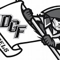 This is a high school mascot
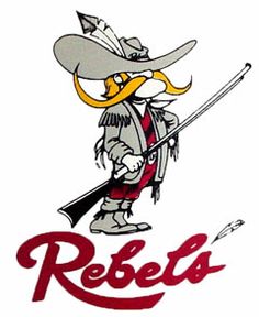
 Ole Miss
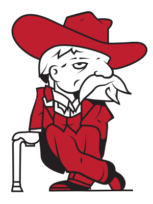
 Another high school
Many "Rebel" mascot look-a-likes out there. The redesign is definitely unique to our Rebels and our city.
Many "Rebel" mascot look-a-likes out there. The redesign is definitely unique to our Rebels and our city.
Last edited:
The Old Miss Rebel doesn't remind me of our old logo or ours of theirs. He looks like the KFC dude or something.I actually like the new (redesigned) logo. I like that it is unique to Las Vegas. Once it gains national recognition there will be no doubt what school and what town it represents when seen.
This is a high school mascot
Ole Miss
Another high school
Many "Rebel" mascot look-a-likes out there. The redesign is definitely unique to our Rebels and out city.
The other two definitely are rip offs from UNLV.
We aren't going to have to worry about anybody stealing our new logo.
It kinda seems at this point that the University has very quietly killed the logo and have probably gone back to the drawing board with something a little less divisive.
We can only hope.It kinda seems at this point that the University has very quietly killed the logo and have probably gone back to the drawing board with something a little less divisive.
Just got my football tix in the mail. The package is devoid of any UNLV logo with one exception - season tickets. Each one does indeed have the new logo on it. I still think they are going to change it.
Another refresh would be embarrassing, I don't think they will do it.
I do think they will probably tweek it. they'll probably still have the basic image of Hey Reb, but probably more isolated and obvious. they'll probably try to trim away other part of the crest, hopefully the current iteration of the scarf, maybe the mountains. I think the star stays.
I do think they will probably tweek it. they'll probably still have the basic image of Hey Reb, but probably more isolated and obvious. they'll probably try to trim away other part of the crest, hopefully the current iteration of the scarf, maybe the mountains. I think the star stays.
Just got my football tix in the mail. The package is devoid of any UNLV logo with one exception - season tickets. Each one does indeed have the new logo on it. I still think they are going to change it.
Just got the basketball tickets and there is not one single new logo anywhere.
I think we can officially call the new logo failed and gone. Not sure why the University hasn't.
UNLV, the school that offers a PhD in spin, openly ADMITTING that they screwed up? You should know better than that. They'll do anything to protect.... I don't know what it is they are trying to protect... jobs? Surely not reputation.... it's just nonsense on Maryland Parkway.Just got the basketball tickets and there is not one single new logo anywhere.
I think we can officially call the new logo failed and gone. Not sure why the University hasn't.
Try something new.... accountability. Novel concept. Say "we screwed up, we paid money for garbage, we could have had much better with minimal payment by offering the student body a chance to create... or we could have opened it up to the fan base, a contest for logos... winner gets a 4 pack of downstairs season tickets this year" (there are plenty available). But you see, that means admitting a (gasp) mistake. I can't remember the last time UNLV admitted to one of those while the docket was being filled with them.
Seriously. When have you seen an admission of a screw up?You mean actually resort to common sense?
No sir! We will have none of that here!
Remember the 50k sideways yellow ampersand in Thomas and Mack at the main entrance, maybe circa 2000? A sideways ampersand? Trying to be hip? Trying to be a trendsetter? Who came up with that idea. Only 50k or whatever it was to put it upright.
I will buy no products with the new logo. I am buying up old stuff to hold me until this garbage is gone.
Similar threads
- Replies
- 232
- Views
- 6K
- Poll
Line ‘em up: Predictions and Game Thread Regular season finale - San Jose at UNLV
- Replies
- 104
- Views
- 2K
- Replies
- 116
- Views
- 3K
ADVERTISEMENT
ADVERTISEMENT