
Colleges
- AAC
- ACC
- Big 12
- Big East
- Big Ten
- Pac-12
- SEC
- Atlantic 10
- Conference USA
- Independents
- Junior College
- Mountain West
- Sun Belt
- MAC
- More
- Navy
- UAB
- Tulsa
- UTSA
- Charlotte
- Florida Atlantic
- Temple
- Rice
- East Carolina
- USF
- SMU
- North Texas
- Tulane
- Memphis
- Miami
- Louisville
- Virginia
- Syracuse
- Wake Forest
- Duke
- Boston College
- Virginia Tech
- Georgia Tech
- Pittsburgh
- North Carolina
- North Carolina State
- Clemson
- Florida State
- Cincinnati
- BYU
- Houston
- Iowa State
- Kansas State
- Kansas
- Texas
- Oklahoma State
- TCU
- Texas Tech
- Baylor
- Oklahoma
- UCF
- West Virginia
- Wisconsin
- Penn State
- Ohio State
- Purdue
- Minnesota
- Iowa
- Nebraska
- Illinois
- Indiana
- Rutgers
- Michigan State
- Maryland
- Michigan
- Northwestern
- Arizona State
- Oregon State
- UCLA
- Colorado
- Stanford
- Oregon
- Arizona
- California
- Washington
- USC
- Utah
- Washington State
- Texas A&M
- Auburn
- Mississippi State
- Kentucky
- South Carolina
- Arkansas
- Florida
- Missouri
- Ole Miss
- Alabama
- LSU
- Georgia
- Vanderbilt
- Tennessee
- Louisiana Tech
- New Mexico State
- Middle Tennessee
- Western Kentucky
- UTEP
- Florida International University
High School
- West
- Midwest
- Northeast
- Southeast
- Other
- Alaska
- Arizona
- California
- Colorado
- Nevada
- New Mexico
- Northern California
- Oregon
- Southern California Preps
- Washington
- Edgy Tim
- Indiana
- Kansas
- Nebraska
- Iowa
- Michigan
- Minnesota
- Missouri
- Oklahoma Varsity
- Texas Basketball
- Texas
- Wisconsin
- Delaware
- Maryland
- New Jersey Basketball
- New Jersey
- New York City Basketball
- Ohio
- Pennsylvania
- Greater Cincinnati
- Virginia
- West Virginia Preps
ADVERTISEMENT
Install the app
How to install the app on iOS
Follow along with the video below to see how to install our site as a web app on your home screen.
Note: This feature may not be available in some browsers.
You are using an out of date browser. It may not display this or other websites correctly.
You should upgrade or use an alternative browser.
You should upgrade or use an alternative browser.
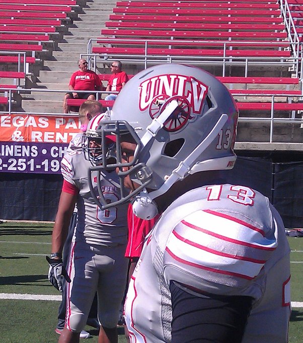
Mountain West Football Helmets
- Thread starter 220reb
- Start date
I know I should "hate" AFA since they are in our conference but I have way too much respect for all of the service academies.
Out of all of their helmets, the fourth row all the way to the right one looks the coolest to me.
Out of all of their helmets, the fourth row all the way to the right one looks the coolest to me.

I’m the same way. Well, the “hate” I’ve felt for conference foes has diminished. Because the rivalries have lost steam, on both sides. UNLV isn’t what they were, SDSU is a shell of themselves, same with UNM. “Hate” has grown for UNR because they went from horrifically bad to the best and one of the nation’s top 20 In just a couple of years and they dominated UNLV.I know I should "hate" AFA since they are in our conference but I have way too much respect for all of the service academies.
Out of all of their helmets, the fourth row all the way to the right one looks the coolest to me.
But even when UNLV was solid, a tourney team, and AFA was at their all-time best, I didn’t “hate” Air Force. Yeah, I despised the constant flops. But man, these dudes are real. While basketball is “life” for every other college basketball player, hoops is a distant priority for these men. All service men, all sports. They are serving and preparing to serve our country and the potential price tag is their very life.
If you can’t respect that, then you have some jacked up priorities, IMO. You don’t have to love them, you don’t have to root for them on the court. But take a step back and see what these guys are about, what they stand for. It should be humbling and it should give some pride. It does for me.
Unfortunately, especially now, many don’t see it that way. Respect for those types has been crapped upon. It’s shameful, IMO.
I definitely dont hate AFA, I do however hate byu.
We are all united in this...
Please don’t post UNR’s helmets, especially this week.
This....
Ok I will skip FUNR. It's not like they ever had any cool helmets.This....
Big fan of the concrete grey with the cannon, matte black with HeyReb! logo (though they could have something like http://theblueandorangestore.com/me...b8d27136e95/b/s/bsu_black_orange_helmet_2.png that Boise State helmet. Enlarge the logo a lot and do some black-space minimization of the logo, maybe using only scarlet and grey and letting the black of the helmet show through), and the last one, UNLV letter logo with the Stars and Stripes.Don't know about anybody else, but the concrete grey from the Hauck era were my favorite.
Big fan of the concrete grey with the cannon, matte black with HeyReb! logo (though they could have something like http://theblueandorangestore.com/me...b8d27136e95/b/s/bsu_black_orange_helmet_2.png that Boise State helmet. Enlarge the logo a lot and do some black-space minimization of the logo, maybe using only scarlet and grey and letting the black of the helmet show through), and the last one, UNLV letter logo with the Stars and Stripes.
Yeah, I think we should have wore them on Saturday since we had the Cannon in our possession!
Gernerally wasn't a fan of that era of Unis. Basic, actually a rip from what Kansas State was wearing at the time. Nothing against traditional, but UNLV ain't traditional.Don't know about anybody else, but the concrete grey from the Hauck era were my favorite.
That being said, that all gray set was very slick. And the cannon was a nice touch. Even the helmet by itself was cool.
Gernerally wasn't a fan of that era of Unis. Basic, actually a rip from what Kansas State was wearing at the time. Nothing against traditional, but UNLV ain't traditional.
That being said, that all gray set was very slick. And the cannon was a nice touch. Even the helmet by itself was cool.
The bad era for uniforms were the Sanford..
I wanted to root for another team.
Similar threads
- Replies
- 0
- Views
- 88
- Replies
- 0
- Views
- 163
ADVERTISEMENT
ADVERTISEMENT