
Colleges
- AAC
- ACC
- Big 12
- Big East
- Big Ten
- Pac-12
- SEC
- Atlantic 10
- Conference USA
- Independents
- Junior College
- Mountain West
- Sun Belt
- MAC
- More
- Navy
- UAB
- Tulsa
- UTSA
- Charlotte
- Florida Atlantic
- Temple
- Rice
- East Carolina
- USF
- SMU
- North Texas
- Tulane
- Memphis
- Miami
- Louisville
- Virginia
- Syracuse
- Wake Forest
- Duke
- Boston College
- Virginia Tech
- Georgia Tech
- Pittsburgh
- North Carolina
- North Carolina State
- Clemson
- Florida State
- Cincinnati
- BYU
- Houston
- Iowa State
- Kansas State
- Kansas
- Texas
- Oklahoma State
- TCU
- Texas Tech
- Baylor
- Oklahoma
- UCF
- West Virginia
- Wisconsin
- Penn State
- Ohio State
- Purdue
- Minnesota
- Iowa
- Nebraska
- Illinois
- Indiana
- Rutgers
- Michigan State
- Maryland
- Michigan
- Northwestern
- Arizona State
- Oregon State
- UCLA
- Colorado
- Stanford
- Oregon
- Arizona
- California
- Washington
- USC
- Utah
- Washington State
- Texas A&M
- Auburn
- Mississippi State
- Kentucky
- South Carolina
- Arkansas
- Florida
- Missouri
- Ole Miss
- Alabama
- LSU
- Georgia
- Vanderbilt
- Tennessee
- Louisiana Tech
- New Mexico State
- Middle Tennessee
- Western Kentucky
- UTEP
- Florida International University
High School
- West
- Midwest
- Northeast
- Southeast
- Other
- Alaska
- Arizona
- California
- Colorado
- Nevada
- New Mexico
- Northern California
- Oregon
- Southern California Preps
- Washington
- Edgy Tim
- Indiana
- Kansas
- Nebraska
- Iowa
- Michigan
- Minnesota
- Missouri
- Oklahoma Varsity
- Texas Basketball
- Texas
- Wisconsin
- Delaware
- Maryland
- New Jersey Basketball
- New Jersey
- New York City Basketball
- Ohio
- Pennsylvania
- Greater Cincinnati
- Virginia
- West Virginia Preps
ADVERTISEMENT
Install the app
How to install the app on iOS
Follow along with the video below to see how to install our site as a web app on your home screen.
Note: This feature may not be available in some browsers.
You are using an out of date browser. It may not display this or other websites correctly.
You should upgrade or use an alternative browser.
You should upgrade or use an alternative browser.
New UNLV logo...
- Thread starter RedCannon
- Start date
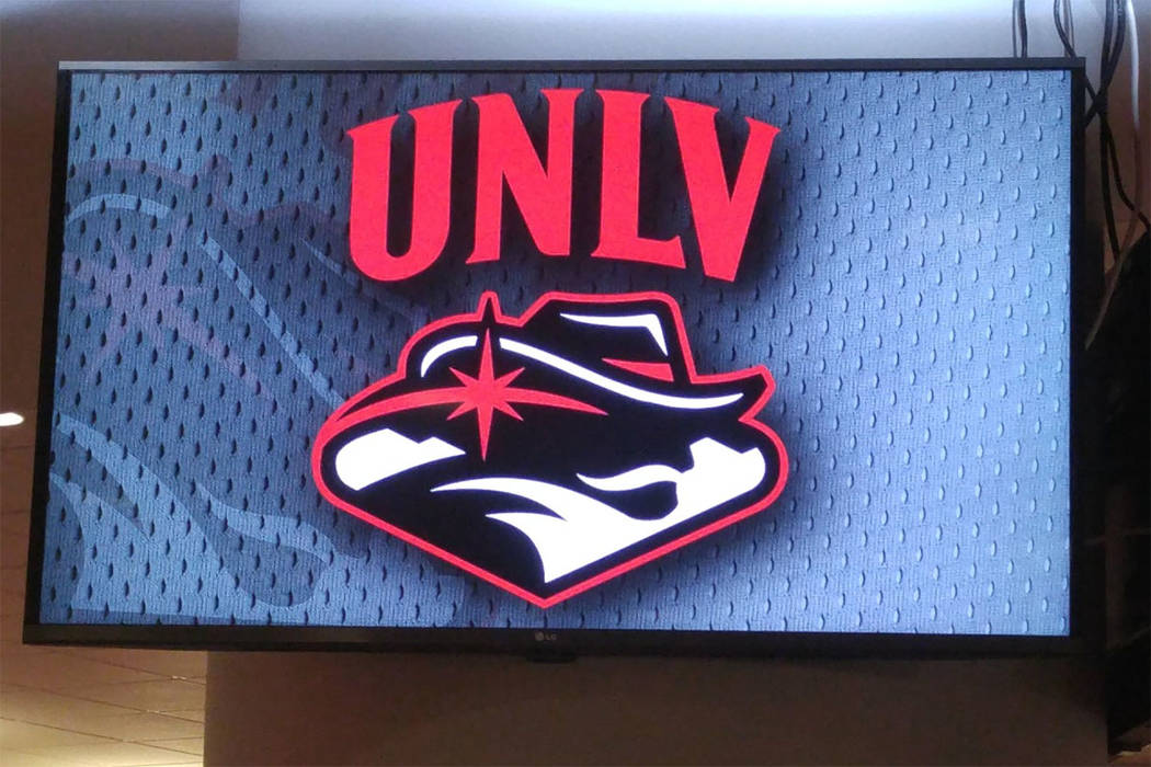
I happen to REALLY like this!... How they brought in a modern feel to the Rebel and incorporated the welcome to Las Vegas sign! I was afraid they would be too conservative with it and slightly adjust some things... they really committed to the idea of a NEW ERA for the whole university.
I saw the negative feedback they are getting and was a bit surprised. I don't really see how people can't immediately see the rebel and LV sign incorporated. Well, I guess I'm in the overall minority according to other polls, but I wanted to see about those that follow UNLV football.
Any input??...
I saw the negative feedback they are getting and was a bit surprised. I don't really see how people can't immediately see the rebel and LV sign incorporated. Well, I guess I'm in the overall minority according to other polls, but I wanted to see about those that follow UNLV football.
Any input??...
Last edited:
It's ok to me. I think it's more that the new logo is more in line with current design trends. I just don't like the mountains. If this is used more as an official university seal I wouldn't hate it, but I don't think it's great for athletics use. We'll see what happens with it going forward.
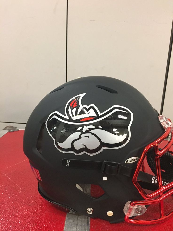
Only time the old Hey Reb was on unis was on a few helmets (Softball/ Football) but can easily be replaced with the arched UNLV which is what is more prominently displayed on most uniforms and apparel.
I did find it interesting that none of the coaches appeared to tweet about it or mention it on social media. I didnt expect any major changes to the football unis but I am curious if any new things will be introduced this season.
I did find it interesting that none of the coaches appeared to tweet about it or mention it on social media. I didnt expect any major changes to the football unis but I am curious if any new things will be introduced this season.

They'll continue to just feature the classic UNLV arch as rebelbuck said.
As much as I do like that logo- I'm still a bigger fan of using the UNLV arch on the helmit.... Although the current black helmit with the Hey Reb is bad ass. I guess it just needs to be done right and in limited circumstances.
If the current football uniforms uses old Hey Reb on either jersey or helmet as it did last year, THEY SHOULD NOT HAVE RELEASED A NEW LOGO YET.I've heard the new mark was introduced too late to incorporate in any of this year's apparel but don't expect any major changes going forward that would incorporate it. They'll continue to just feature the classic UNLV arch as rebelbuck said.
Ferkin basic 101 marketing. Damn.
Being a native of Las Vegas and going to UNLV in the mid 80s, I have never been a fan of Hey Reb. Even as a kid. To me I always felt embarrassed of Hey Reb thinking it was too cartoonish, not cool, and just not something I ever could get behind. The new logo looks sharp. I really like it. I'd take this over Hey Reb any day.
Hey Reb was only on the shoulders I believe last year , easily replaced with other design elements.
They have all new gear in the bookstore already with the new logo.

I really don't care for this logo. It took me about to 10 seconds to even see hey reb. The version with scarlet and gray is better, but still not that great to me. About Hey Reb being too cartoonish, I totally get what you're saying, but I think that is common across most universities. Think about Florida, Wisconsin, Ok st., all have very cartoonish athletic mascots, but they have continued with them for years. I say embrace Hey Reb. Or if you want to come up with a new logo, move away from Hey Reb and focus on the city. Just come up with a cool LV with some lights and landmarks in the background.Being a native of Las Vegas and going to UNLV in the mid 80s, I have never been a fan of Hey Reb. Even as a kid. To me I always felt embarrassed of Hey Reb thinking it was too cartoonish, not cool, and just not something I ever could get behind. The new logo looks sharp. I really like it. I'd take this over Hey Reb any day.
Universities are moving away from cartoonish. It was a thing that has its time. But it's over.I really don't care for this logo. It took me about to 10 seconds to even see hey reb. The version with scarlet and gray is better, but still not that great to me. About Hey Reb being too cartoonish, I totally get what you're saying, but I think that is common across most universities. Think about Florida, Wisconsin, Ok st., all have very cartoonish athletic mascots, but they have continued with them for years. I say embrace Hey Reb. Or if you want to come up with a new logo, move away from Hey Reb and focus on the city. Just come up with a cool LV with some lights and landmarks in the background.
The new logo still has Hey Reb... he just matured in my opinion... he resembles more of a tough ass moving forward Rebel. They also embraced the city of Las Vegas by incorporating the sign, which has been missing.
The remix logo posted by Mojo702 has a clean look to it too, but again I'm a fan of having the arch UNLV to continue to be the main focal point.
The remix logo posted by Mojo702 has a clean look to it too, but again I'm a fan of having the arch UNLV to continue to be the main focal point.
About being cartoonish, there's a difference between logo and mascot. I was referring to the logo itself. We have Yosemite Sam as our logo (though I do like YS) I don't want him as my school LOGO. "Mascot?" That's something different. You mentioned Ohio St. That creepy looking thing isn't the school's logo but he is the school's mascot. The current Hey Reb can stay the school on field mascot. I'm ok with that
It's a mess, to put it mildly. I had to read an explanation of what it means, to understand it. I wish UNLV would abandon the "Rebel" mascot & logo. They are meaningless, anymore, altho at the time, it was understandable.
UNLV needs a mascot & logo that better fit our time and place! How about something like, the Magic, or the Luck? With all the publicity talent in the Valley, it should not be the challenge it's apparently becoming.
UNLV needs a mascot & logo that better fit our time and place! How about something like, the Magic, or the Luck? With all the publicity talent in the Valley, it should not be the challenge it's apparently becoming.
Last edited:
I'm not in love with the old Hey Reb, but if they are going to change it they need to do better than this, IMO.
The remixed one posted above by @Mojo702 is considerably better. It's got a clearly recognizable mountain range and bandanna, so that's a nice start ha.
I have no trouble picking out the new Marlboro man version of Hey Reb in the new UNLV crest, but I just don't see myself buying anything with it on there. It's not aesthetically pleasing at all.
As an academic institution, UNLV probably doesn't want to identify itself too much w/ the gaming community, not that it's ungrateful to a major source of its revenue, but, as I said, I think UNLV has to look at ideas other than the meaningless "Hey, Reb!" or reference to gambling.
Since showbiz underlies UNLV's economy, how about "the UNLV Stars?" Something to identify UNLV with its location, academic mission, some local flora/fauna, geographic feature, whatever.
Since showbiz underlies UNLV's economy, how about "the UNLV Stars?" Something to identify UNLV with its location, academic mission, some local flora/fauna, geographic feature, whatever.
There are thousands of graduates from UNLV with 6-7 figure salaries due to the gaming industry, that is what will push UNLV forward. No other industry gives anywhere near the same amount of donations to UNLV. I go along with coach Sanchez and see no reason not to embrace the gaming and tourism industry.
I'm not in love with the old Hey Reb, but if they are going to change it they need to do better than this, IMO.
The remixed one posted above by @Mojo702 is considerably better. It's got a clearly recognizable mountain range and bandanna, so that's a nice start ha.
I have no trouble picking out the new Marlboro man version of Hey Reb in the new UNLV crest, but I just don't see myself buying anything with it on there. It's not aesthetically pleasing at all.
Totally agreed here. To some extent they could do a general university logo (the one they showed is fine in this case IMO) and have a separate one for athletics.
OK, fine. Then how about a county-wide contest, sponsored by UNLV, to select a more suitable mascot/logo, whatever, than "Hey Reb?" There has to be publicity talent in this Valley.There are thousands of graduates from UNLV with 6-7 figure salaries due to the gaming industry, that is what will push UNLV forward. No other industry gives anywhere near the same amount of donations to UNLV. I go along with coach Sanchez and see no reason not to embrace the gaming and tourism industry.
I happen to REALLY like this!... How they brought in a modern feel to the Rebel and incorporated the welcome to Las Vegas sign! I was afraid they would be too conservative with it and slightly adjust some things... they really committed to the idea of a NEW ERA for the whole university.
I saw the negative feedback they are getting and was a bit surprised. I don't really see how people can't immediately see the rebel and LV sign incorporated. Well, I guess I'm in the overall minority according to other polls, but I wanted to see about those that follow UNLV football.
Any input??...
Its a rorsarch test...
How about this one...?
I like that... they did a good job of having the hat also reflect the Mountain West logo...
I do not like that logo. It resembles a Cowboy and this conference already has one of those. Kill that. Now.
They can tweak it some and make it somewhat salvageable. If they isolate the Hey Reb face and hat, keep the star and use that more than the entire emblem. Having it face one direction can be a decent alternate helmet emblem. That is an easy fix for football. Hell, they added a cannon to the Helmet a few years ago at the last minute that one game.
Who is they ???I like that... they did a good job of having the hat also reflect the Mountain West logo...
Who is they ???
he/she - they... whoever composed that logo. I shouldn't have referenced it as a team that did it - my bad.
I actually like the remix logo that Mojo702 posted before better. ... a work in progress I guess... as they didn't use the "new" logo at media day.
Slightly changed. Not a huge difference. Top is adjusted. Exterior slightly adjusted.I believe the shape of the hat stayed the same as it was before.
OK, looks like "Hey Reb" will be the UNLV mascot/logo. Saying that, I suggest "UNLV" be dropped from the logo. "Hey Reb" should be enough for people to know what it means w/o "UNLV." Along w/ that, football helmets & other uniforms could simply have "Reb" in a cursive script," instead of "UNLV." Once UNLV football and basketball, the two premier programs in any school's athletic program, have gotten to the top of the MWC, no one will be ignorant of what "Hey Reb" means.
Last edited:
Similar threads
- Replies
- 6
- Views
- 468
- Replies
- 5
- Views
- 2K
- Replies
- 1
- Views
- 463
- Replies
- 4
- Views
- 562
ADVERTISEMENT
ADVERTISEMENT